


New Delhi, Jan 14 (IANS) BRICS operates as a major geopolitical force in a turbulent world, and the logo unveiled this week for 2026 reflects India’s understanding of that responsibility.
The symbolism through lotus, the Namaste, and the carefully crafted message together conveys an India that seeks BRICS to be “resilient but not rigid, inclusive but not amorphous, ambitious but grounded”, a report said on Wednesday.
“By unveiling the logo and website for BRICS 2026 this week, External Affairs Minister S Jaishankar did more than mark the start of India’s chairship preparations. He offered a carefully constructed statement of intent, about how India sees the world, its place within it, and the kind of multilateralism it believes is worth building at a time of global uncertainty,” a report in India Narrative detailed.
“At first glance, a logo launch may appear ceremonial. But in diplomacy, symbolism often speaks as loudly as policy. As BRICS approaches its 20th anniversary in 2026, India’s choice of imagery and message is revealing. It suggests a chairship that seeks to blend civilisational confidence with contemporary global leadership, without sounding ideological or exclusionary,” it added.
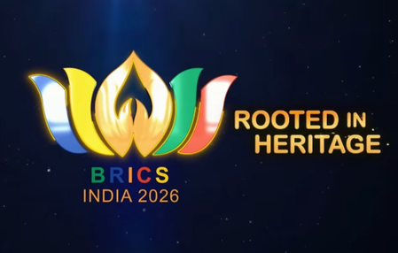
According to the report, the logo draws inspiration from the lotus, a symbol that holds deep significance in India’s cultural heritage.
“The lotus rises unblemished from muddy waters, a metaphor that resonates strongly in today’s fractured international environment. Multilateral institutions are under strain, trust deficits are widening, and emerging economies are demanding a more equitable voice. By choosing the lotus, India appears to be signalling resilience without confrontation, renewal without rupture,” it detailed.
“Equally significant are the petals, rendered in the colours of BRICS member nations. This is not a subtle assertion of dominance, but a visual acknowledgement of plurality. The message is clear: BRICS is no longer a compact club but a diverse coalition with varied political systems, economic models and regional priorities. Unity here is not uniformity, but coordination around shared interests,” it further mentioned.
The Namaste gesture at the centre of the logo represents an Indian symbol with universal appeal.
“It conveys respect, mutual recognition and dialogue on equal terms. In the context of BRICS, this choice reflects India’s effort to position itself as a convenor rather than a commander, especially as the grouping expands and internal diversity grows more complex,” the report stated
The tagline accompanying the logo, ‘Building for Resilience, Innovation, Cooperation and Sustainability’, embodies India’s diplomatic worldview.
“It avoids the language of blocs and binaries, instead foregrounding outcomes that resonate across the Global South and beyond,” the report noted.
IANS
scor/as